
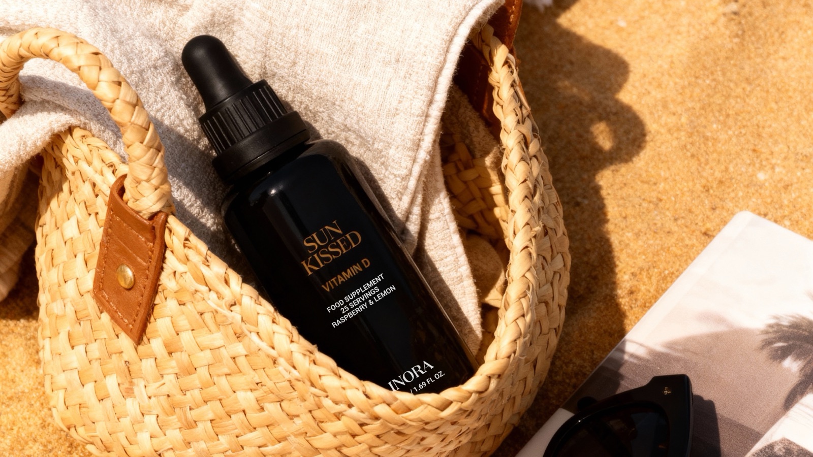
AI can put your bottle on a marble counter in morning light, with a sprig of something green beside it, faster than your team can approve the sprig. Lovely. Now read the label. If the brand name has grown an extra letter and the dosage line has turned into elegant gibberish, you have made a very attractive problem.
Product visuals live or die on product truth. The scene around the product is free to be invented. The product itself has to be exact. Everything the customer, the retailer and the regulator will read on that pack has to match the real thing, down to the cap.
Product truth has more parts than people expect
Label text comes first: brand name, product name, ingredients, dosage, warnings and the small print, every word spelled as printed. Then colour, matched to the physical pack and the brand’s own references. Then the cap and closure, because generators have a habit of swapping a dropper for a pump. Then proportions, since a bottle a touch too slim reads as a different product. Then the claims.
Claims catch people out. In categories like supplements, an image can make a claim without a single word. Put the bottle beside a fruit that is absent from the formula and you have suggested an ingredient. Surround it with a glowing medical halo and you have suggested a benefit. Your legal team will want a word.
Start from the real product, every time
When we produced product visuals for Inora, a wellness brand that makes liquid nutritional supplements, they wanted realistic images that looked natural and trustworthy. We worked from their photos and ideas, built natural scenes with soft textures and neutral colours, and kept the focus on the product. The part that mattered most was matching their exact label details and colour tones, so every image stayed accurate and consistent.
That order is the method. Start with clear photos of the actual product from several angles, the print-ready label files if you have them, and the brand’s colour references. Generate the world around the product. Then treat the product as something to verify, frame by frame, before anyone falls in love with the lighting.
If the product is about to be repackaged, say so on day one. A beautiful set of images built around last season’s label is a fast way to do the work twice.
A checklist before anything goes public
Run this before a single image leaves the building:
- Compare every line of label text with the print file, letter by letter, zoomed in.
- Check pack and label colour against the physical product under neutral light.
- Confirm the cap, closure and pack shape match the current version of the product. Packaging changes more often than brand decks admit.
- Check proportions against a real photo taken from the same angle.
- List every claim the image makes, written or implied, and get each one approved by whoever owns claims.
- Name one person who signs off product truth, separately from the person who signs off the look.
Separate the look from the truth
The last item is the one teams skip. Creative review asks whether the image is beautiful. Product review asks whether it is correct. Put both in the same meeting and beauty tends to win, because it is more fun to talk about. Run them separately, and run product review last, on the final files.
It helps to write down, before any review, which details are fixed and which are open. The label, the cap and the colour are fixed. The surface, the props and the light are open to taste. Reviewers then know which comments are corrections and which are opinions, and urgent fixes stop getting lost in a debate about the shade of the marble.
A softer shadow is a matter of taste. A wrong label is a failure, and it is the one customers screenshot. I go into that difference in my piece on quality control. For product shots, the rule fits on a sticky note: imagine the world around the bottle, and keep the bottle true.